
Toolbar & Configuration
Configure Toolbar Appearance, Position and Colors
This guide documents the Pluro workflow illustrated in the accompanying product screenshots. Available controls may vary by plan and product release.
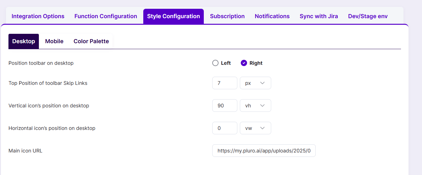
Where to find the settings
Open your licensed website in MyPluro and select Style Configuration. The visible tabs include Desktop, Mobile and Color Palette.
Desktop positioning
Use the Desktop tab to choose Left or Right for the toolbar. Set the top position of skip links, vertical icon position and horizontal icon position. Check the selected units, such as px, vh and vw, before saving.
Mobile positioning
In Mobile, use Allow toolbar on mobile to enable the toolbar and select the side and icon offsets. Verify that the floating control is not hidden behind mobile navigation or cookie notices.
Color palette
Under Color Palette, configure the tool’s available border, background, text, button and icon colors. Preview color contrast and keyboard focus against the actual customer website. Browser support and the exact available controls can differ across product releases.
Validate after saving
Test both desktop and mobile layouts, zoom, keyboard navigation and screen-reader naming. Position and color settings do not replace accessibility testing.
Product documentation note: Review permission settings, current account functionality and the actual result before applying changes to a customer website.